The second competition of NEXA
A significant feature in housing construction in Iran returns to the idea ofpassive box-style buildings. Economical and municipal regulations do not facilitate the creation of geometric forms and are known as the architectural culture of residential design. The main movement of this market has been to employ architects for the singular purpose of ease and speed in sales of these boxes. Various ways of painting these boxes are placed on the drafting tables for architects. Consequently, if these painted boxes, or as Venturi states: “decorated lodges,” are understood to be driving forces and recognition for architects, Nexa Architecture Competition, which has been sponsored and directed by developers and investors, can be seen as a summary report on the criticism of this reflexively passive architecture.
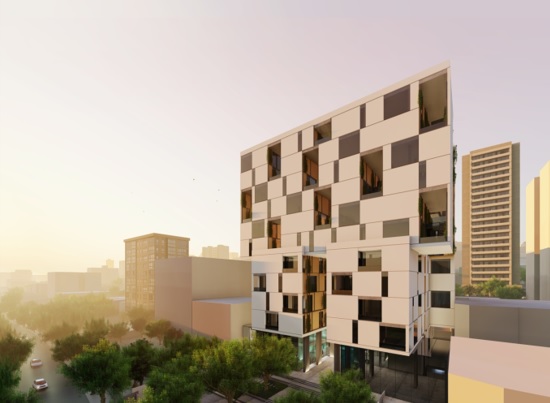
The participants of this competition were four architecture groups. The designs of Dida Architecture Office faced the least criticism in relation to painted boxes that are considered tantamount to the abovementioned culture. The architecture is composed of a box with economical and cost effective plans and that which occurs between floor plans of the units is nothing more than vertical and horizontal circulation space in the building. The façade of the buildingplays a role of covering the failures and shortcomings of the architecture.
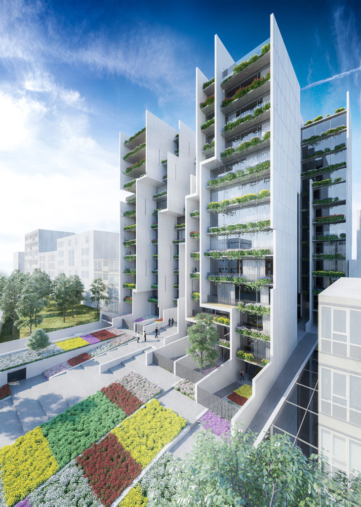
The design of SHIFT Studio addresses the current situation with criticism in two levels: 1. regarding the function of this project; 2. with regard to the typology of the common apartment. In the first, the conventional program of the apartment is unraveled. The prevailing program for an apartment consists of placing public or joint-use areas in the ground floor and lower levels, with the residential units located in the upper floors. SHIFT created a vertical urban core by extruding public areas vertically. With the strict oversight of public domains in Iran, and borrowing inspiration from shopping centers where central public spaces are located internally, SHIFT drew the public activity inside the structure. In the second, there is a number of units in a row with different functions with evident incorporation of apartment typology.
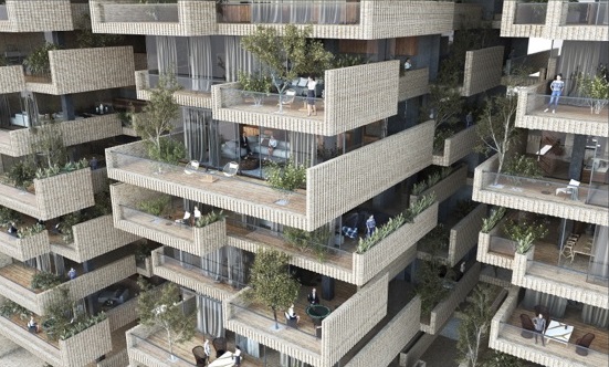
The main elements of FMZD Architecture Studio are dynamic terraces that mediate internal and external spaces which provide an attractive visual aesthetic to the project. In contrast to SHIFT, where concentration of public activity is drawn inward, FMZD protracted activity spaces outwardly so they are no longer privately shared spaces but public spaces integrated as terraces. FMZD’s criticism of the reigning designs of residential buildings, is buttressed by not accepting the box-logic, and resisting the common ideas regarding façade design while challenging the current culture of life style of escaping to internal spaces.
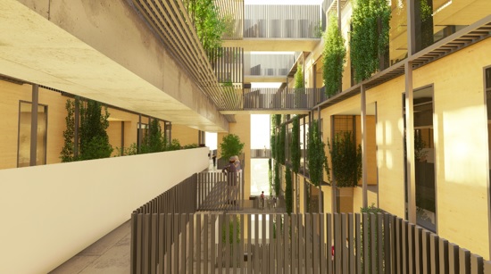
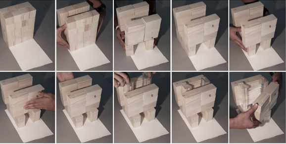
Boozhgan Architecture Studio is a distinct example of challenging the box idea based on sanity. The box was broken into 4 pieces, optimizing light penetration with stunning views in the various levels. These cleavages provide the formation of open garden spaces within the levels. By transforming shared spaces into small elevated urban-style pathways with the closed apartment type, Boozhgan has challenged the prevailing norm.
