Phoenix – Challenge Studio
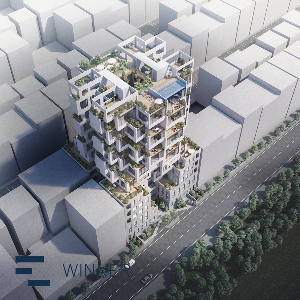
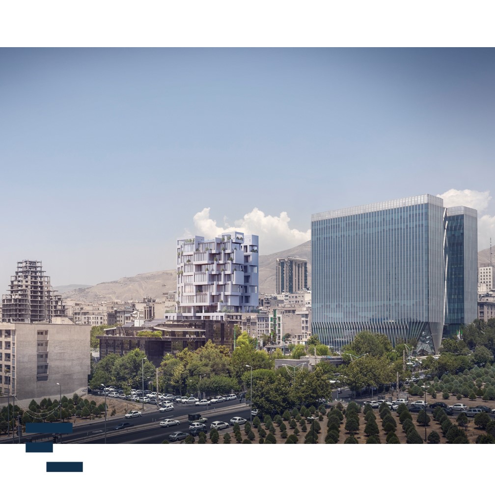
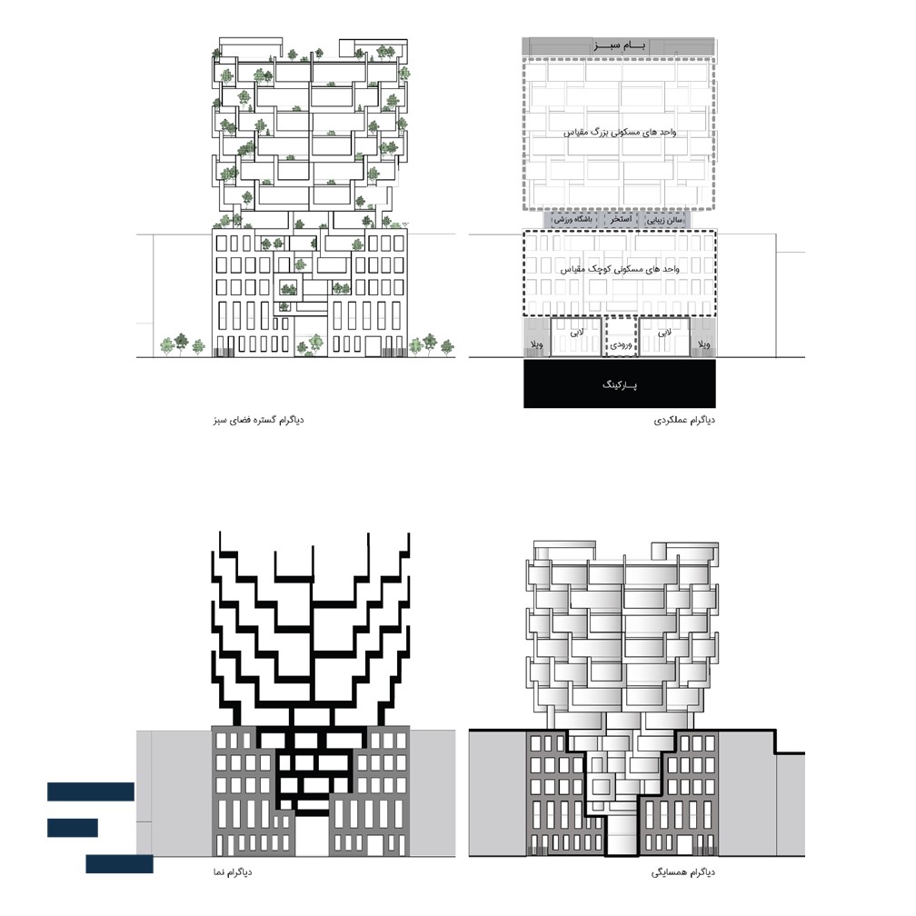
One of the most important motivations for selecting this design, was the adjacent structures and the multiple levels of the floors relative to the neighboring buildings. This design was concentrates on the neighborhood’s configuration in order to provide an appropriate solution for the function of the urban appearance of the residential project of Nexa 34. Also, attention to empty spaces (voids) between neighboring structures (courtyards of neighbors to the northwest and northeast) were other significant elements for starting the design process.
Based on these perimeters, the chosen design method was grounded on ancient Iranian -9square geometric architecture.
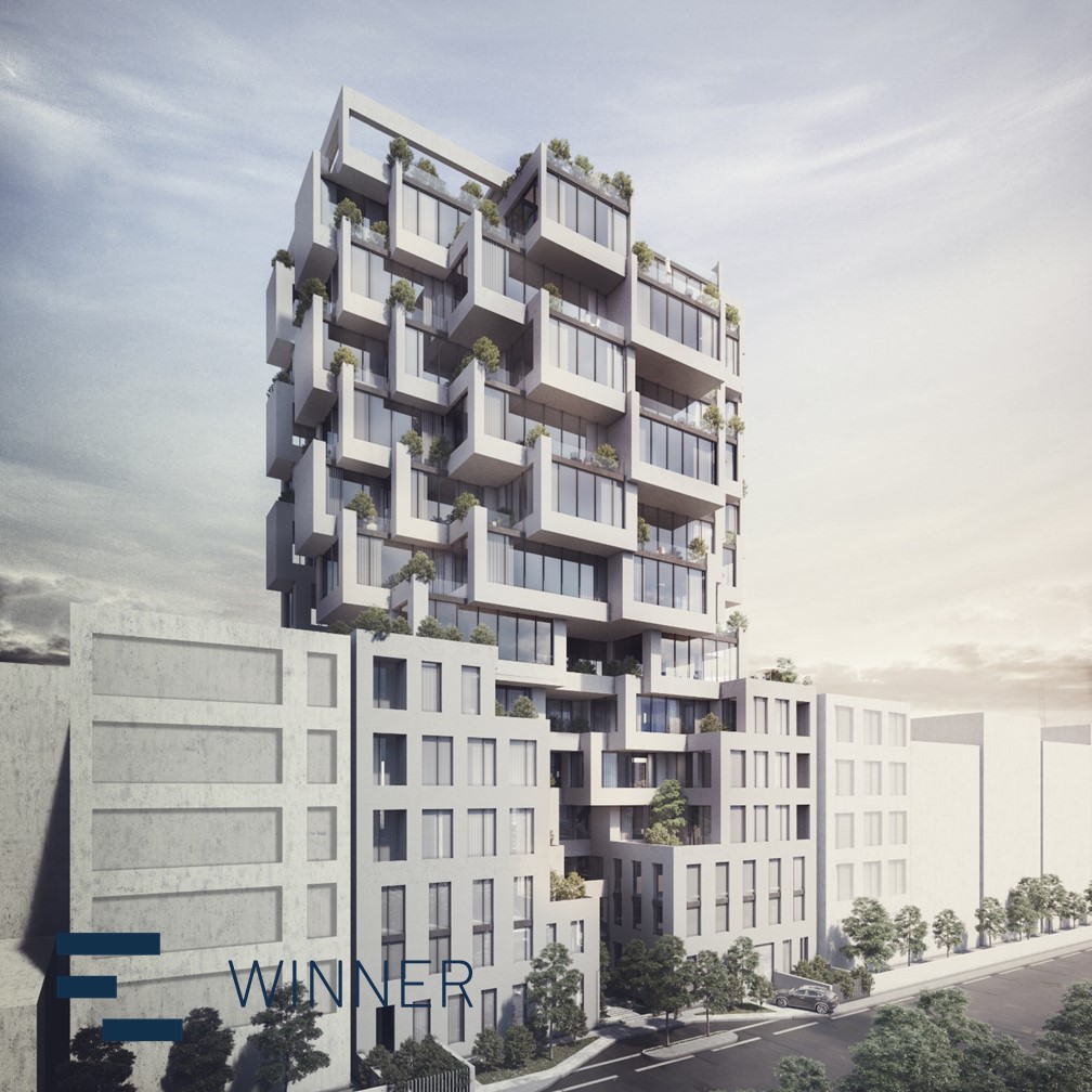
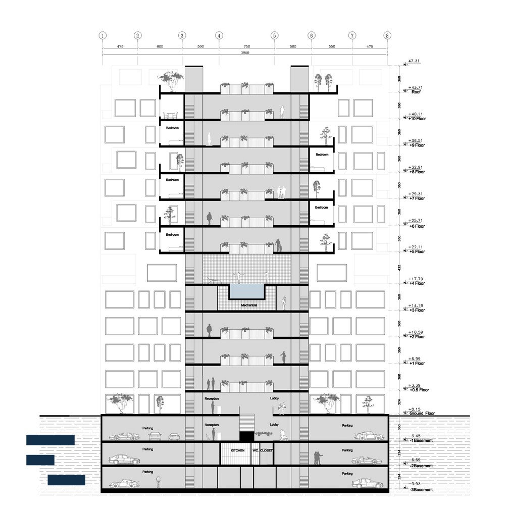
The 4 corner-squares in the lower portion of the design are filled, up to the height of the neighboring structures. In doing so, the scale of the neighborhood’s physical proportions was preserved. The middle squares, at the east and west, are emptied with the intention of continuing the neighboring courtyards.
Additionally, the north and south middle squares were also emptied to give access to the north and south streets.
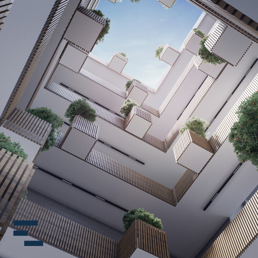
The upper half of the design, follows a reverse pattern where the 4 middle squares are filled. This approach allowed an increase in surfaces for the permeation of natural lighting while creating better opportunities for views as well as generating variety in spaces within the design. Additionally, the shifting and sliding of floors horizontally, provided terraces with considerable area and dimensions for the residential units. This process, created 360 degree facades in the upper portions of the design with substantial impact on urban aesthetics.
